It took a little more time, and we decided to slightly change the design. They did not change the template, because it is functional and this one suits, but I wanted to make the colors warmer, or, so to speak, less dull and official. Did it work though? It got a little better?
Plus, some elements have also changed. And they will continue to change. There are also plans to make a normal heading, and change the headings, redo the labels. Who has any opinions on this matter? What is missing and what is superfluous?
Of course, we have already invented everything based on other blogs, but maybe your thoughts will also be useful and it will be possible to combine all the pros and remove the minuses. In general, we will be glad to all your comments and criticism. It is understood that all opinions cannot be taken into account, but it is at least necessary to find out.
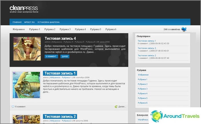
Unfortunately, we don't have a screenshot as it was before, but there is a picture of how the template looked in the early days of the blog's existence, the color scheme is just old.

Old template.


