Probably everyone has already noticed that we have completely changed the design on the blog. Someone will like it, someone, probably not, we will continue to edit. I have long wanted to put on something more modern, with a white background, minimalist and more airy or something. The whole year was going, but still there was not enough time to sit down like this and do it all at once. Yes, and I put it not fully completed, the hat was changed several times and it was temporary for 2 weeks. But it was necessary to somehow speed up this process, and when installed, you can't get out, don't roll back 🙂
Now this template will stand for the next couple of years until you want to change it again. And from time to time I will do something with him, in fact, I am already doing, one or another question comes up. And although visually, it may seem that something is not really changing now, but in fact the work is going on, just behind the scenes 🙂
Current template
The replacement of the template was also caused by the technical obsolescence of the previous one. It would be possible, of course, to completely rewrite it, but I absolutely did not want to do this. So I bought the Yootheme Nano3 template, which is written in a separate Warp framework and includes the Uikit framework. Honestly, my knowledge was barely enough to figure it all out, but thank God I didn't have to go too deep. There is absolutely no technical support, they answer in a key «figure it out for yourself, everything works for us». Therefore, I will not recommend them..
What's good about the template:
- Customizable view through the admin panel. Fonts, indents, block sizes, colors, in general, everything that is in CSS can be configured in the visual Customizer. There are several pre-installed designs. But I hardly used it.
- This template does not have a standard sidebar, and widgets can be positioned on the right / left, bottom / top. Moreover, the widgets have several different designs that you can choose for any of them..
- One of my favorite tricks is that for all widgets you can specify which pages they should be displayed on and which shouldn't. It is also possible to disable display on mobile devices, making the appearance of the site easier.
- Another nice thing is Font Awesome, a vector font in the form of pictures, which helps a lot to visually improve certain elements..
- The column menu is truly convenient! How tired I am that we had many levels of nesting here, and until you reach the desired item, the menu will have time to close.
What have I been doing for the last month
- It is difficult to list all the technical aspects, and there is no need for it. In short: I figured out how the template works (everything is completely different there), reworked all sorts of elements, set up a template for custom types, changed non-working plugins for working counterparts, fought with a floating widget and with comments working without reloading (ajax), made a search from Google, open graph, etc. Well, and then I will list more noticeable things..
- There was a button «Say thanks». Let's see if there will be any sense from it. Maybe I'll just make it later in the form of a counter.
- Subscription to the site is now all reduced to one button «Subscribe to», to make it visually clearer. And there, when you click, all the options. And most importantly, without rebooting.
- The site has an Orphus system for correcting spelling errors. It is necessary to select it with the mouse and press CTRL + Enter, after which the error will be sent to my mail. This feature was there before, but now there is a more noticeable picture below..
- I cleaned up all sorts of counters, widgets for social networks, disabled some scripts and plugins, optimized images. In theory, the site should load faster than before. At least the tests say so. I have 50 Mbps internet now, so there isn't much of a difference for me. I'll go to Thailand and find out. Acceleration work will still continue, not finished.
- We started moving to another hosting, to a more powerful one, so that you can use all the features of the caching plugin without exceeding the load. I didn't want to move, as Beget suits everyone, but what to do. I don’t want to cut the functionality on the site, so I’ll have to move. In addition, the server will be abroad, where later it will be possible to deploy the site in English and outside the Russian jurisdiction. Recent events are something completely confusing, and apparently the sites should already be done there, and not here. I have already encountered problems - the card plug-in stopped working, which addresses to a foreign address, which for some reason became blocked from Russia.
- The menu has been redesigned, now it is one main, instead of two. Should be clearer. Also, if you go to the heading Thailand, or to Europe, you will see an additional menu in the sidebar. But I'm still thinking about the structure.
- Fixed sections Houses on Koh Samui and Houses in Krabi, now everything should work fine there, otherwise the search worked crookedly.
Probably, there is something else, but you can't remember everything. So just below the pictures for the story.
Previous templates
The previous template was actually just one. That is, it lasted as much as 4 years, periodically changing, because I finished it on the go. It has become completely different from the one that was downloaded from open spaces in 2010. In fact, he was present in 3 visual views on the blog, remaining the same inside.
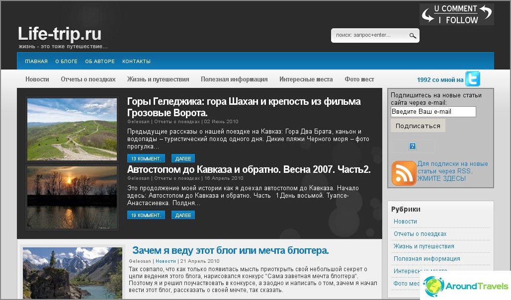
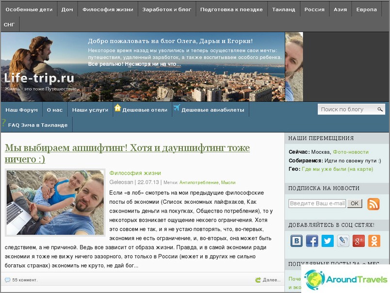
The 2010 design lasted a little over six months, Daria wanted green
The 2010-2011 design looks a little ridiculous now
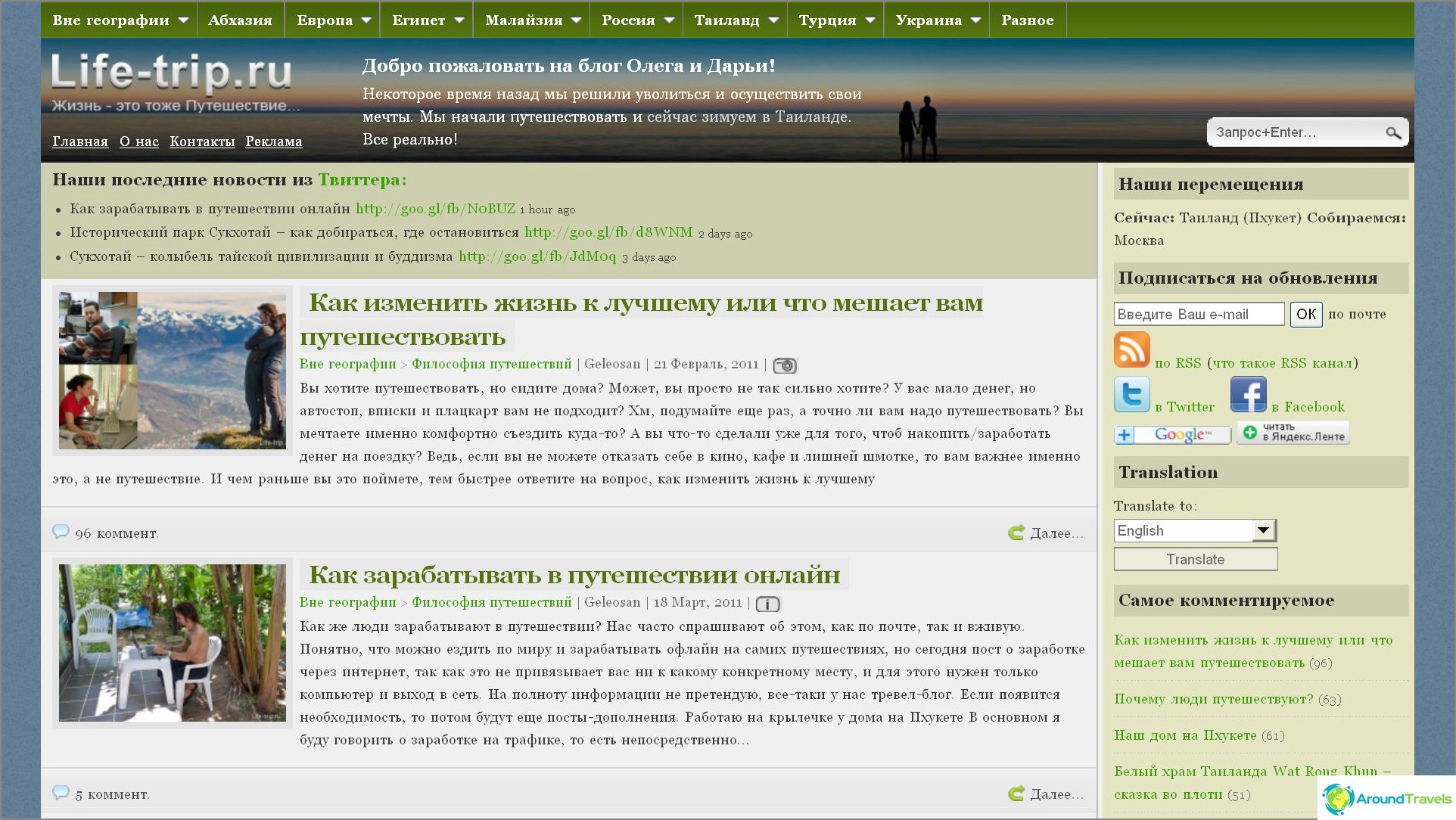
The site was in this form from 2011 to 2013
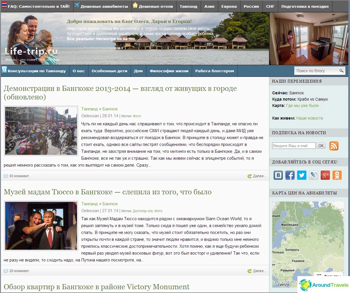
The same thing, only the hat was changed at the end of 2013 and this design was still a year
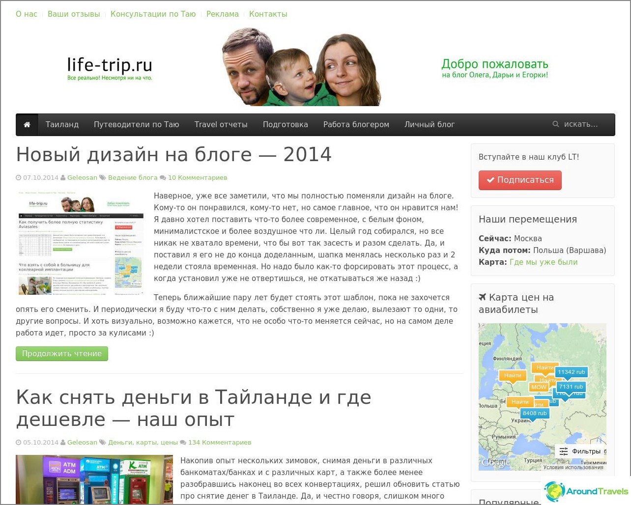
Current design, end of 2014
P.S. I have everything for today, I am ready to listen to criticism and wishes. In general, there is something in this, in being updated sometimes 🙂
P.P.S. Most people didn't like the hat (judging by the comments), so I removed it. Will there be something else there, I don't know, I have no ideas of my own, but no one suggested anything.